NAPP o2o
Projeto realizado como consultora para NAPP em parceria com a equipe NBU e outras 7 unidades de produtos Google. Participei desde a criação dos primeiros conceitos em UI para aprovação do projeto, cocriei as etapas de pesquisa e síntese com o time de UX/Produto Google e fui responsável pelas entregas de UI e interatividade, cuja aprovação do time Google era necessária para continuidade do projeto.
Visão de futuro
ícones
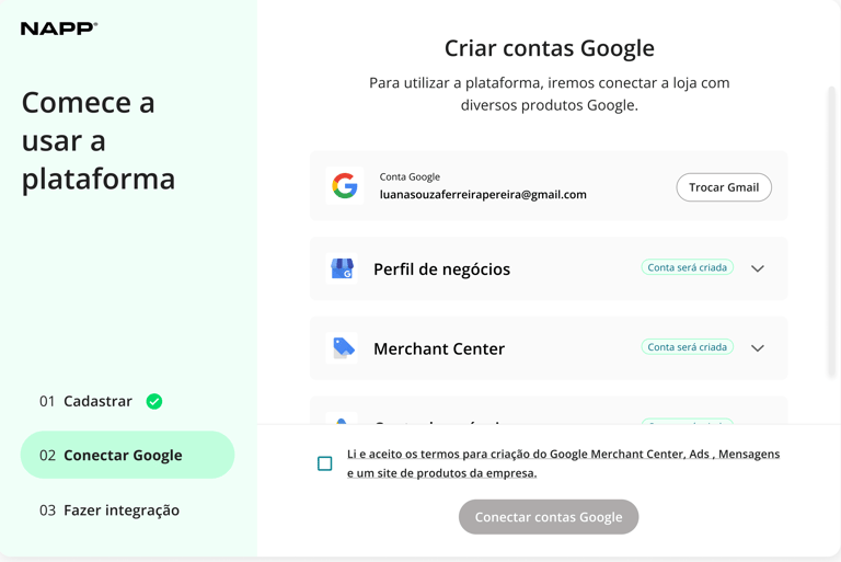
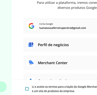
Onboarding contas Google
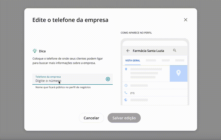
Edição de dados Google
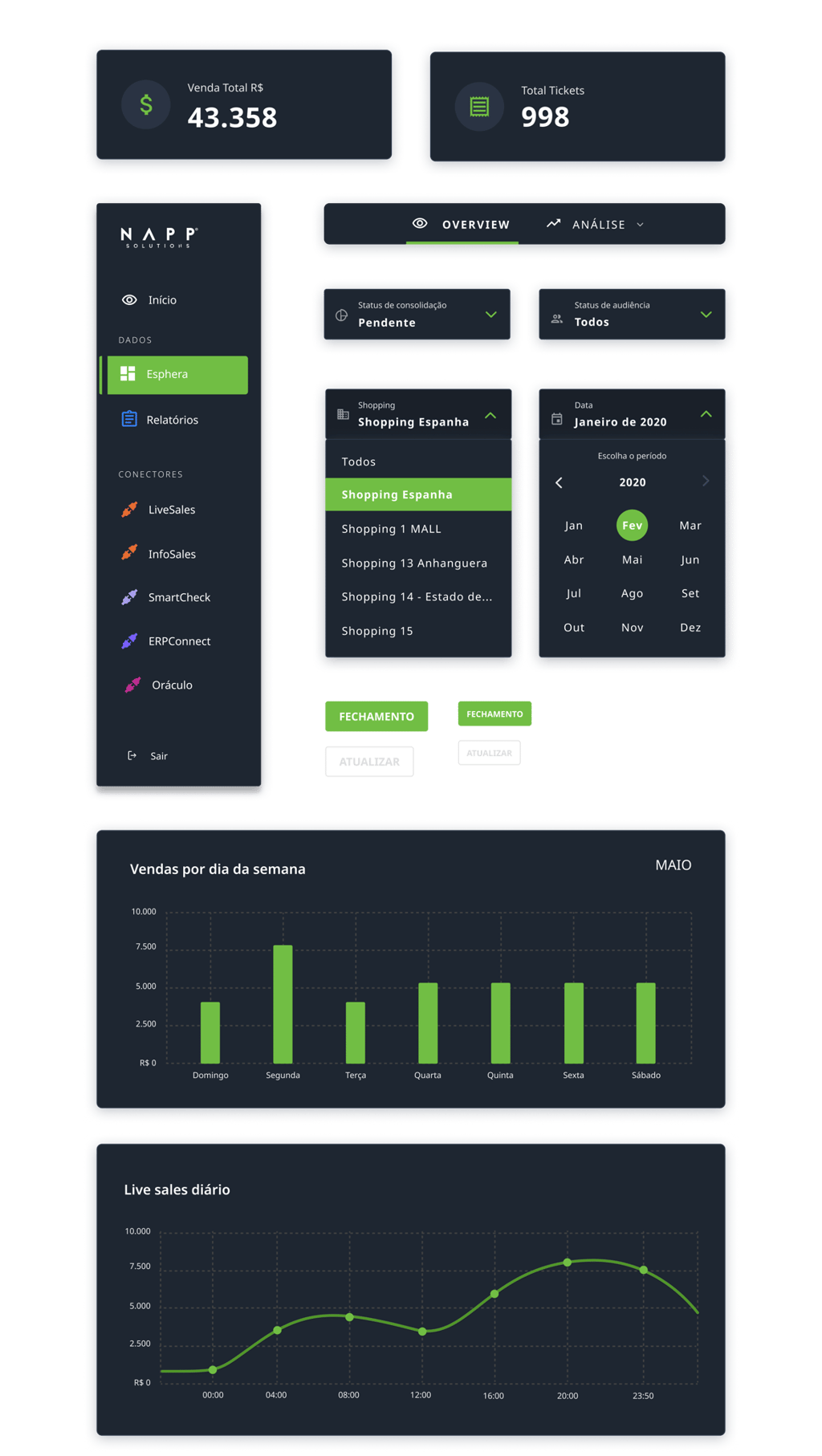
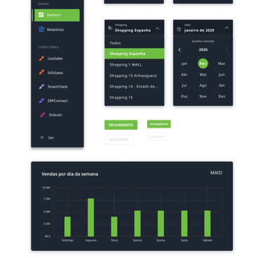
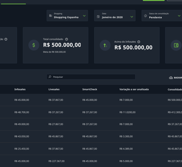
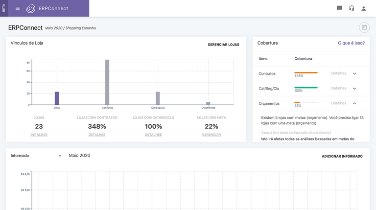
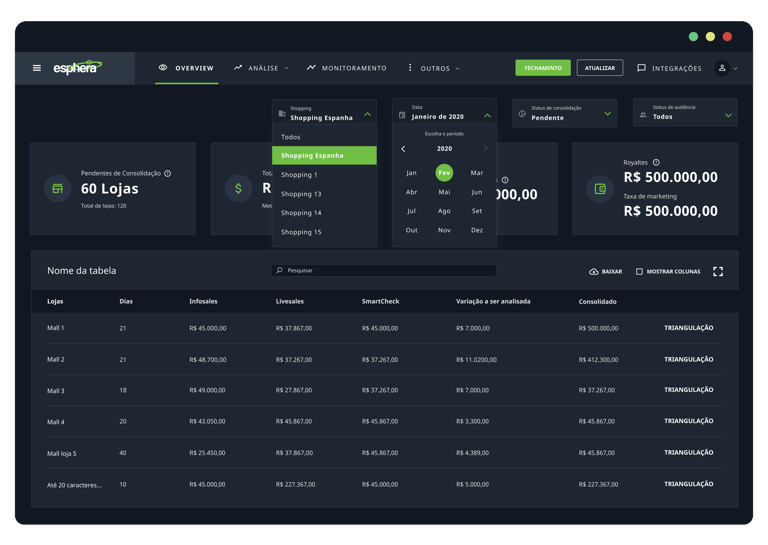
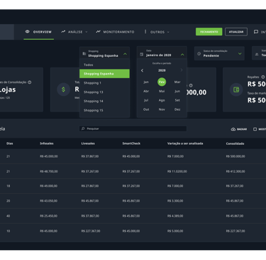
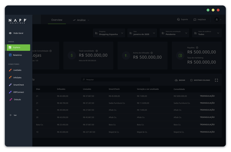
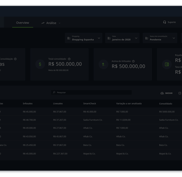
NAPP Retail dashboards
NAPP is a B.I company that provide information to help retail companies improve their businesses.
Project conducted as consultant, redesigning company's data products for the retail market in Brazil.
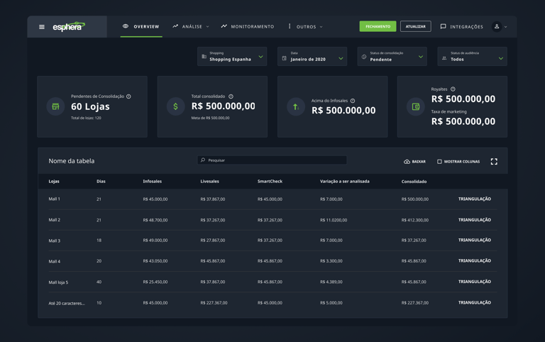
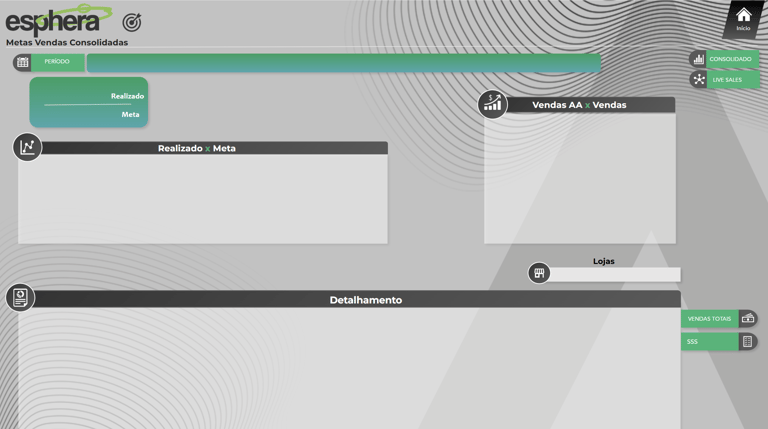
Esphera Dashboard delivered
Role
2021
Period
Data UI designer
Problems
Lack of consistency and patterns
NAPP delivered data in three ways: Power B.I, PDF and in a mvp version of platform, all of them were different from each other.
Also didn't have a design pattern for their products and designed different every journey making complex to find information on some panels.
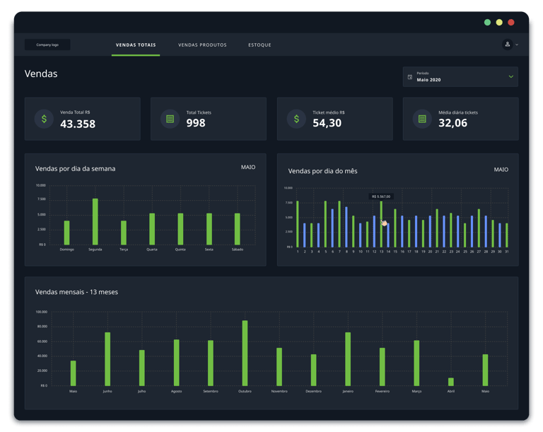
Sales PDF Dashboard
Bad layout
The data appeared in different formats and positions, not properly utilizing the screen space, and squeezed some information to fit.
Power B.I Background layout

Understanding scenario
I've promoted some conversations and investigated different arctfacts of NAPP to understand how people used their solutions so far, including:
Heatmap and user sessions analisis
Data indicators and qualitative reports by users
Usability analisis
Customer success interviews
Confuse Flow
Users constantly share difficulty in finding the data they want, seem not have a logical way to find the information between the 3 solutions, in user sessions it was clear how people came and go in a flow.
Power B.I Dashboard
Hidden information
Filter and important actions were represented only by icons and with disabled visual aspects.
Redesign Outcomes
-63%
Customer success calls because of dashboards usability
+32%
In monthly CSAT score
-356h
for month spend in development, maintanence and support
Data + findable
Increased satisfaction
Effort reduction
UI Dashboards
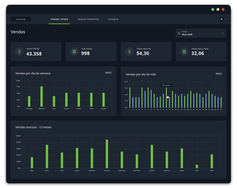
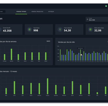


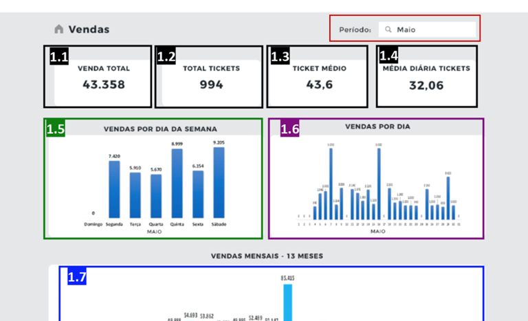
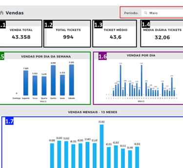
Sales Dashboard
PDF Sales report
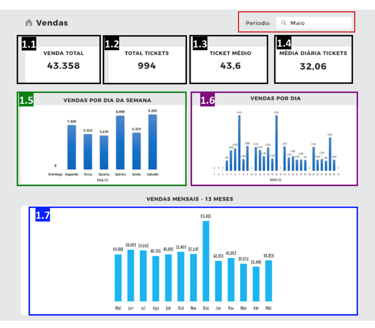
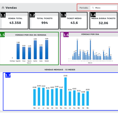
Before > After

Dashboards platform initial page


Dashboards Power B.I. + PDF initial page
X
X
Color palette
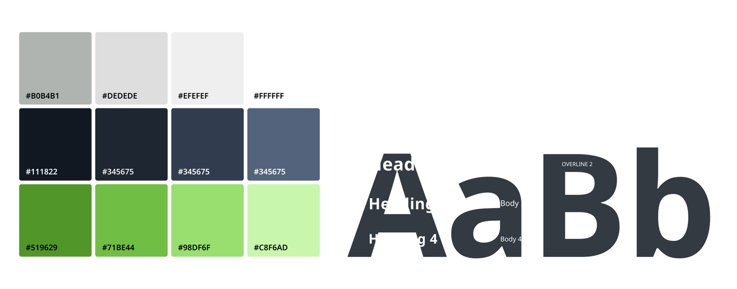
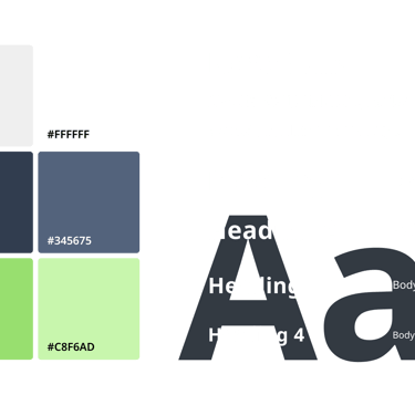
Typography
Components